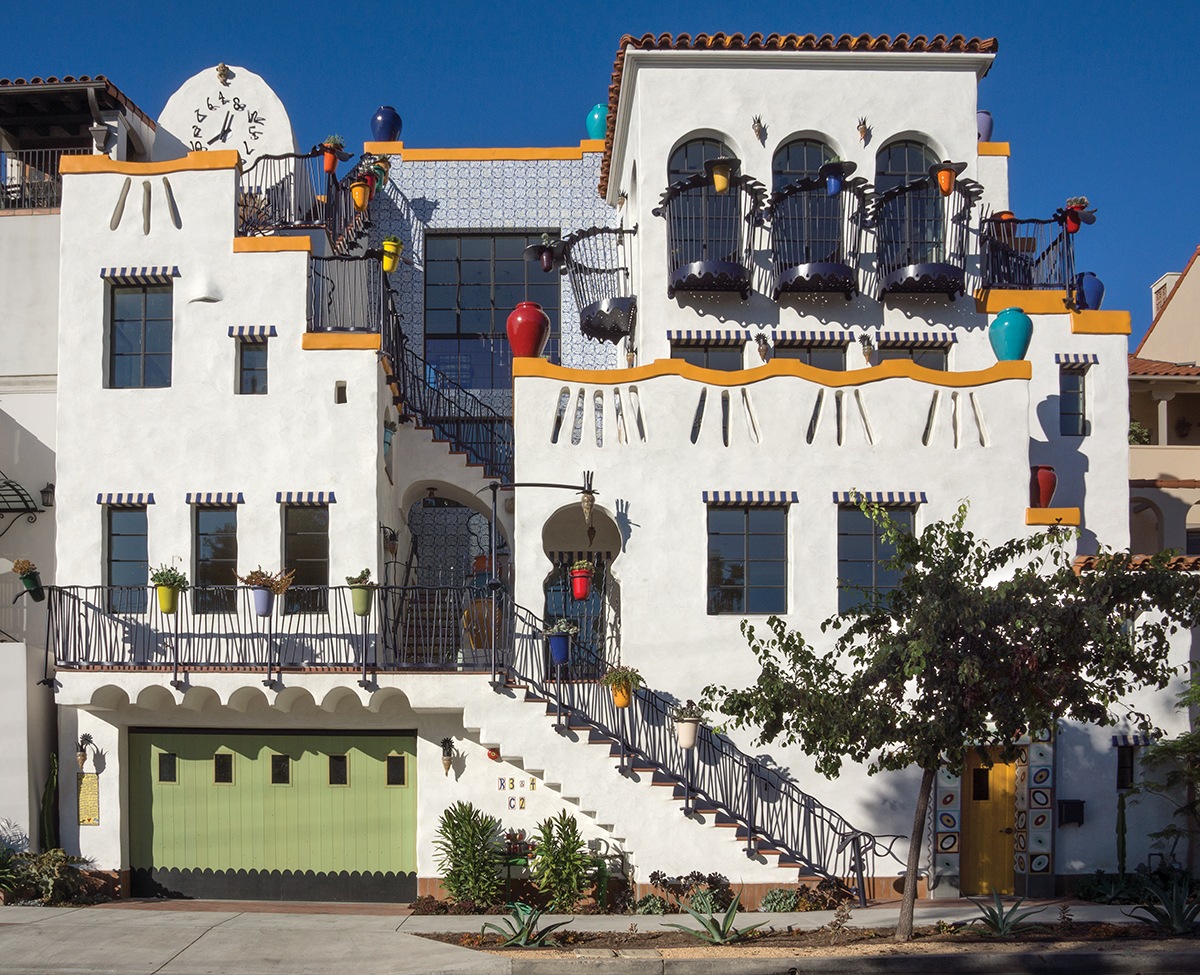
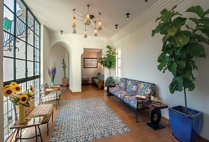
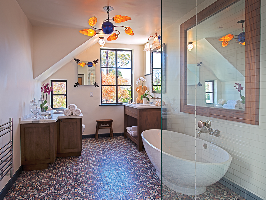
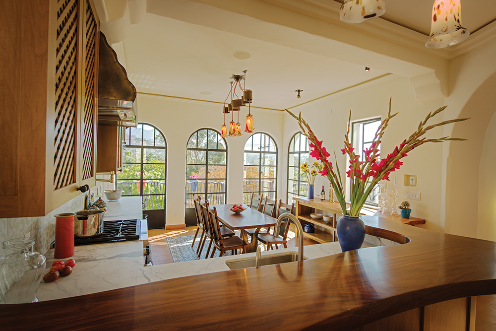
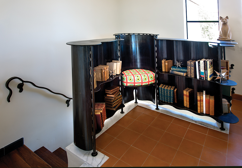
It’s hard to miss a Jeff Shelton–designed building. In a world of carefully aligned conformity, his buildings are the ones doing the limbo to a cascade of slightly bent jazz notes. They can seem to tilt or careen. They wink, break rules and defy expectations at every turn. They are treasure troves of artful surprises. His newest downtown project, El Jardin, fits right in, with one foot rooted firmly in the classic Spanish vernacular that informs much of Shelton’s work, while the other dances through a Carnival street wearing yellow foam shoes and a checkered blue suit.
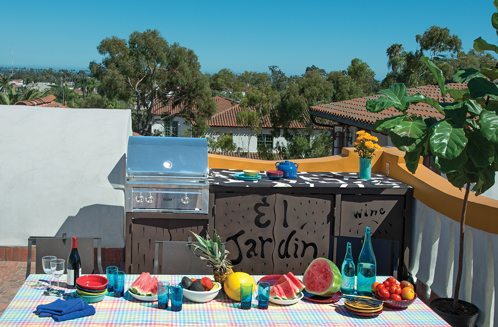
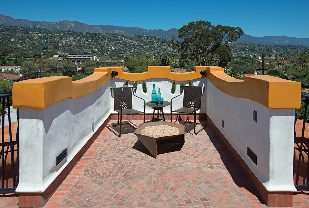
The mixed-use Garden Street property has a ground-floor garage, a first level of commercial space and a residence that includes two interior levels plus a rooftop deck with a hot tub, a fire pit, a dining area and an outdoor kitchen. An elevator services all levels. Likes its predecessors, this Shelton building wants its owners to have fun. “I like them to have a little bit of life, a little bit of humor and enjoyment, a little bit of celebration,” he says of the 50 or 60 buildings he has designed in Santa Barbara. By now, Shelton has heard people refer to all of the references they think they see in his work - Gaudí, Dalí, Dr. Seuss. “I love Gaudí, I love Dr. Seuss, I love sand castles,” he says, adding that other influences include Rube Goldberg and MC Escher. “And everything does droop a little bit. There’s a little bit of melting.”
The distinctive look of Shelton’s buildings is born in his own mind, but the execution he credits to his collaborators, a core group of artists and craftsmen he hires for every project. Among them are contractor Dan Upton, glass blower Saul Alcaraz of Santa Barbara Art Glass, iron worker (and brother) Dave Shelton, woodworker David Moseley, and sculptor Andy Johnson. The signature plaster work that gives his buildings their “droop” is created by a group of plasterers who have mastered Shelton’s preferred irregular surfaces and wiggly vertical edges where walls meet while embracing his general opposition to straight lines and right angles in the plaster realm. There are many plasteriffic touches here.
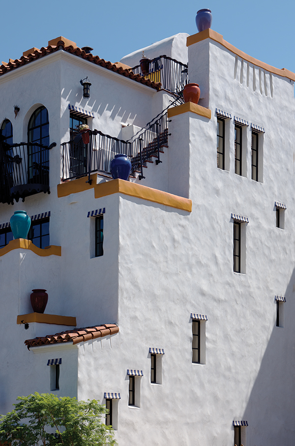
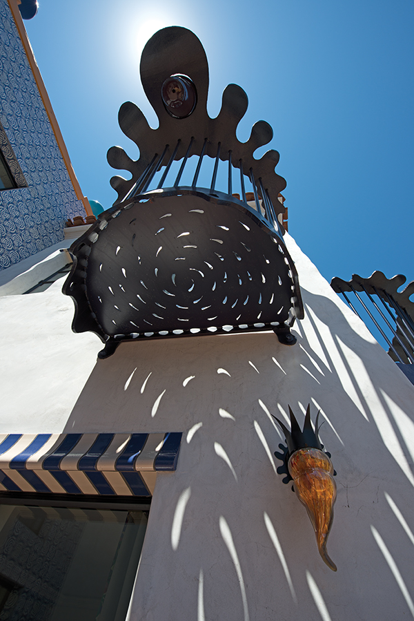
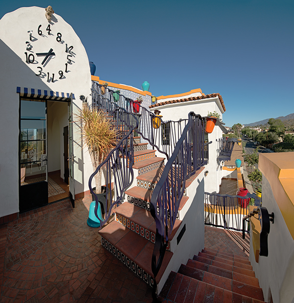
Some exterior walls have groupings of 24-inch-long perforations shaped like lazy exclamation points, while yellow-orange Spanish style caps top the walls. At roof level, a plaster clock tower fronting the street is topped by one of Andy Johnson’s modern gargoyles. The cartoonish face grins broadly while pointing at the clock dial below, the numbers of which are wildly out of sequence and don’t lay on the face, but stand straight out from it. “Why make plaster perfectly straight?” Shelton asks rhetorically. “That’s for steel. Plaster is plastic and has hands on it. You should be able to see that.” As a lover of Spanish vernacular architecture who also believes it should be made new, Shelton uses a lot of his brother’s wrought iron, often in light fixtures that include blown-glass from Saul Alcaraz, whose chile-pepper-shaped sconces are everywhere. The wrought iron for this building appears in details that call to mind the bulbous, globular forms of spilled viscous liquid or the morphing blobs in a lava lamp.
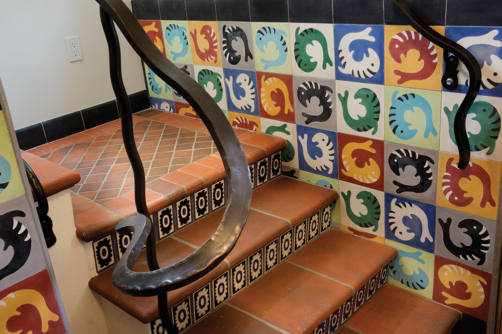
They show up as footings along several stairways, which have wavy wrought iron railings that suggest black ribbons rippling in a breeze. Off the kitchen, the globules appear as part of a vertigo-inducing balcony treatment. Each of four doors leads to a cantilevered wrought-iron container that fits about two people comfortably and vaguely resembles the basket on the cherry pickers used by utility-line workers. The circular “wall” of the bucket consists of closely spaced, not-quite-vertical wrought-iron rods (echoed elsewhere as stairway balasters), and those in turn are topped by the black globule-shaped iron railings, each supporting a brightly colored flower pot from California Art Pottery, another regular Shelton supplier.
Tiles of Shelton’s own design - hand-drawn, often during plane flights - are another through line of his work, and they are on vibrant display in El Jardin. An entire 20-foot-tall front-facing exterior wall is covered with blue-and-white rose-motif tiles, and the top edge of many windows is adorned with tile work that does trompe l’oeil duty, appearing to be a rolled-up awning. A street-level front door is framed by tiles having an assortment of circular motifs that could represent dishes, flying saucers, fish eyes or stylized blood platelets. Stairway risers are tiled, and the traditional Spanish red-tile living-room floor is adorned by a pair of tile “rugs.” Whether grunion, stars, abstract geometrics or squiggles, Shelton’s designs are always asymmetrical; the tiles line up no matter which way they are oriented to each other, but the design never repeats.
As if coming to terms with his own pursuit of architectural punch lines weren’t enough of a challenge, in this building he also had to incorporate more than 200 design dictates issued by the owner’s Feng Shui expert. The entrance, for instance, had to be positioned exactly in the center of the house, and the back door ended up being, well, in the front. But maybe that’s the perfect touch for a house designed by the man who never saw a design “rule” he didn’t want to tweak just a little.
